Tool Controls Bar
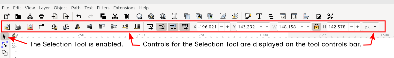
The Selection tool controls bar
In the image above, a red rectangle identifies which toolbar is the tool controls bar. This is arguably the most important toolbar in the interface, because almost every option, for every tool, appears in this toolbar.
That is what makes this toolbar unique. The available buttons are different, depending on which tool in the toolbox is enabled. For example, below is a screenshot of the tool controls bar when the Node tool is enabled. Compare it to the image at the top of the page, which shows the tool controls bar with the Selection tool enabled.
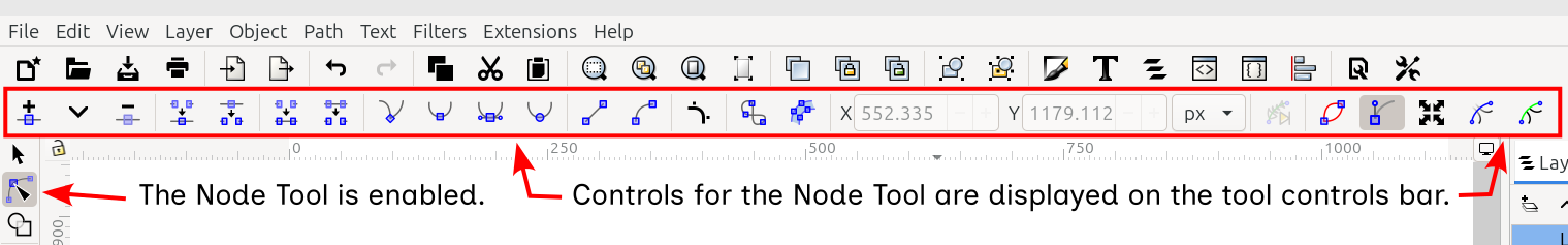
The Node tool controls bar
Below are a couple of other tool controls bars for comparison. Notice how the buttons are different for each tool.
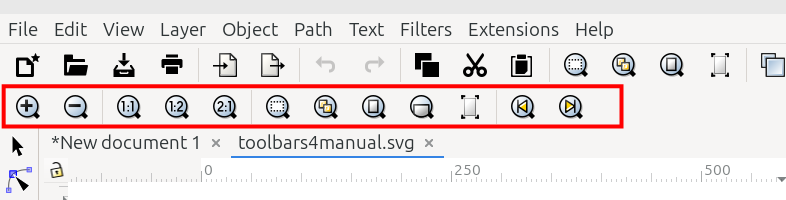
The Zoom tool controls bar
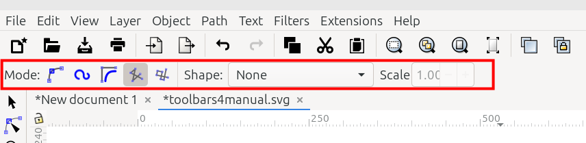
The Pen tool controls bar
Try it in your own Inkscape window. Watch the tool controls bar while you switch to different tools.
No matter which tool may be enabled, the tool controls bar can be temporarily hidden. To do so, uncheck View menu > Show/Hide > Tool Controls Bar.
Tool controls bars, like many of Inkscape’s toolbars, contain two types of elements: buttons and number fields, sometimes called “spinboxes”. Of course operating the buttons is simple. After selecting something on the canvas, just click on a button.
The number fields can be operated in a few ways. First, select something on the canvas to make the number fields active.
Highlight the numbers with a mouse, or delete by backspacing. Then either paste in new numbers, or type new numbers. Press Enter.
Click the small plus or minus buttons to “spin” the number higher or lower.
A very special feature of the number fields is that they can be used to perform simple math: addition, subtraction, multiplication and division. Place a +, -, *, or / after the last number in the box. Then type another number immediately after the sign. After pressing Enter, the result will be displayed in the field. And the object selected on the canvas will respond according to the result.
UNDER REVIEW
Selection Tool Controls Bar

The Selection tool controls bar
The image above shows the Selection tool controls bar. The table below gives either the name or a brief description for each item. Follow the links to find a full expanation.
Icon |
Name of the Button or Number Field and What it Does |
|---|---|
|
Select All: selects everything visible on the canvas |
|
Select All in All Layers: selects everything in all visible layers |
|
Deselect: removes all selections |
|
Touch Selection Mode: objects are selected by dragging across them instead of around them |
|
Rotate 90° to the left: rotates selected objects 90° to the left |
|
Rotate 90° to the right: rotates selected objects 90° to the right |
|
Flip Horizontal: flips the selected objects horizontally |
|
Flip Vertical: flips the selected objects vertically |
|
Raise to Top: move the selection to the top of the z-order stack |
|
Raise One Level: move the selection up one level in the z-order stack |
|
Lower One Level: move the selection down one level in the z-order stack |
|
Lower to Bottom: moves the selection to the bottom of the z-order stack |
|
Scale Stroke Width: scales the stroke width by the same proportion the whole object was scaled |
|
Scale Rounded Corners: scales the radii of round-corner rectangles |
|
Move Gradients: moves gradients along with objects |
|
Move Patterns: moves patterns along with objects |
X position: number field that shows and sets the side to side position of the selected object |
|
Y position: number field that shows and sets the top to bottom position of the selected object |
|
Width: number field that shows and sets the width of the selected object |
|
|
Locked: locks the dimensions so that proportions do not change when the object is resized |
|
Unlocked: unlocks the dimensions so that proportions will change when the object is resized |
Height: number field that shows and sets the height of the selected object |
|
Units: dropdown menu of available units |
Todo
Double-check the manual locations for the links for the last 7 items. Lines 98 - 111. I’m not sure if I chose the right section/chapters.
UNDER REVIEW
Node Tool Controls Bar

The Node tool controls bar
The image above shows the Node tool controls bar. The table below gives the name or a brief description for what each item does. Follow the links to find detailed information about each one.
Icon |
Name of the Button or Number Field and What it Does |
|---|---|
|
Add Nodes: adds a new node between selected nodes |
|
Delete Selected Nodes: deletes selected nodes |
|
Join Selected Nodes: joins two or more consecutive, selected nodes |
|
Break Path at Selected Node: breaks a path at selected nodes |
|
Join Selected Nodes with a New Segment: joins selected end nodes with a new path segment |
|
Delete Segment Between Two Nodes: deletes the segment between two selected nodes |
|
Make Selected Node Corner or Cusp: makes the selected node a corner/cusp node |
|
Make Selected Node Smooth: makes the selected node a smooth node |
|
Make Selected Node Symmetric: makes the selected node a symmetric node |
|
Make Selected Node Auto-Smooth: makes the selected node an auto-smooth node |
|
Make Segment Straight: makes the segment defined by two selected nodes, straight |
|
Make Segment Curved: adds handles to selected corner nodes so the segment can be curved |
|
Add Corners LPE: LPE handles for making smoother curves (I guessed about this one.) |
|
Object to Path: converts the selected object to a path |
|
Stroke to Path: converts a stroke to a path (I guessed about this one.) |
X position: number field which shows and sets the side to side position of the selected node |
|
Y position: number field which shows and sets the top to bottom position of the selected node |
|
Distance: number field that shows and sets the distance between two selected nodes; only shows up when more than one node is selected |
|
Units: dropdown menu of available units |
|
|
Next LPE: shows the next available path effect parameter |
|
Path Outline: toggles the path outline on or off |
|
Node Handles: toggles the display of node handles for selected nodes |
|
Transform Handles: toggles the display of transform handles for more than one selected node |
|
Mask Path: shows or hides the masking path, if there is one |
|
Clip Path: shows or hides the clipping path, if there is one |
UNDER REVIEW
Shape Builder Tool Controls Bar
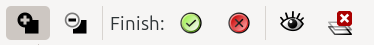
The Shape Builder tool controls bar
Above, the Shape Builder tool controls bar is shown. The table below identifies the icons. It also gives a brief description for each one. Follow the link for a fuller description.
Icon |
Name of the Button and What it Does |
|---|---|
|
Add Shapes: adds shapes to create larger shapes or images |
|
Remove Shapes: removes shapes from larger shapes or images |
|
Accept: after individual shapes have been selected, completes the building of a new shape |
|
Cancel: after individual shapes have been selected, cancels the building of a new shape |
|
unselected object transparency: adjust the transparency of unselected objects (Note - there is no tooltip for this button, so I filled in a reasonable name for it) |
|
Replace objects: deletes the original objects after new shape creation |
Todo
The eye icon has no tooltip, see my note above. Line 221. Also, delete my comment after item is fixed.
UNDER REVIEW
Rectangle Tool Controls Bar

The Rectangle tool controls bar
The image above shows the Rectangle tool controls bar. Below are the names of the number fields and icons, along with a brief description for each one. To find a fuller expanation for them, please follow the links.
Icon |
Name of the Button or Number Field and What it Does |
|---|---|
Width: number field which shows and sets the width of the selected rectangle |
|
Height: number field which shows and sets the height of the selected rectangle |
|
Rx: number field that shows and sets the horizontal radius of a rounded corner |
|
Ry: number field that shows and sets the vertical radius of a rounded corner |
|
Units: dropdown menu of available units |
|
|
Make Corners Sharp: if rectangle corners have been rounded, this makes them sharp again |
UNDER REVIEW
Ellipse Tool Controls Bar

The Ellipse tool controls bar
The Ellipse tool controls bar is shown above. In the table below, please find their name or a brief description for each button or number field. To find a fuller explanation, follow the links.
Icon |
Name of the Button or Number Field and What it Does |
|---|---|
Rx: number field to enter the horizontal radius of the ellipse or arc |
|
Ry: number field to enter the vertical radius of the ellipse or arc |
|
Start: the angle (in degrees) from the horizontal to the arc’s or slice’s start point (for a whole ellipse, this value is zero) |
|
End: the angle (in degrees) from the horizontal to the arc’s or slice’s end point (for a whole ellipse, this value is zero) |
|
|
Slice: draws a slice (may be called “segment” or “wedge” in different versions of Inkscape) |
|
Arc: draws an arc |
|
Chord: draws a chord |
|
Whole Ellipse: draws a whole ellipse |
UNDER REVIEW
Star Tool Controls Bar

The Star tool controls bar
The tool controls bar for the Star tool is shown above. The table below gives the name or a brief description of each button and number field. To find a full explanation, please follow the links.
Icon |
Name of the Button or Number Field and What it Does |
|---|---|
|
Draw Polygon: draws a polygon or switches a star to a polygon |
|
Draw Star: draws a star or switches a polygon to a star |
Corners: enter the number of corners or points wanted for the star |
|
Spoke Ratio: ratio of the base radius to the tip radius |
|
Rounded: changes or displays how rounded each spike or point will be |
|
Randomize: deforms each star randomly – suggested a better name for this setting https://gitlab.com/inkscape/inbox/-/issues/13007 |
|
|
Reset to Default: for any values which the user might have changed, this resets them to their defaults |
Edge: the length of each point or spike |
|
Units: dropdown menu of available units |
UNDER REVIEW
3D Box Tool Controls Bar

The 3D Box tool controls bar
The 3D Box tool controls bar is shown above.
Each number field sets the angle of the perspective lines, for the X, Y, and Z directions of the 3D box.
UNDER REVIEW
Spiral Tool Controls Bar

The Spiral tool controls bar
The Spiral tool controls bar is shown above. The table below gives the name and description for each item.
Icon |
Name of the Button or Number Field and What it Does |
|---|---|
Turns: a number field to set the number of loops in the selected spiral |
|
Divergence: a number field to set the amount of space between loops in the selected spiral |
|
Inner Radius: a number fields to set how much empty space is in the center of the selected spiral |
|
|
Reset: resets parameters to defaults |
UNDER REVIEW
Pen Tool Controls Bar

The Pen tool controls bar
The Pen tool controls bar is shown above. The table below gives the names and descriptions for each item.
Icon |
Name of the Button and What it Does |
|---|---|
|
Regular Bezier Mode: draw paths in regular Bezier mode |
|
Spiro-Spline Mode: draw paths in spiro-spline mode |
|
B-Spline Mode: draw paths in b-spline mode |
|
Straight Line Mode: draw paths in straight line mode |
|
Paraxial Line Mode: draw paths in paraxial line mode |
Triangle In: draw with the Triangle In shape profile |
|
Triangle Out: draw with the Triangle Out shape profile |
|
Ellipse: draw with the Ellipse shape profile |
|
From Clipboard: draw with the Pattern Along Path LPE using the custom shape profile that was saved to the clipboard |
|
Bend from Clipboard: draw with the Bend LPE using the custom shape profile that was saved to the clipboard |
|
Last Applied: draws with the last shape profile that was applied on the canvas |
|
Scale: set the width of the power stroke shape |
UNDER REVIEW
Pencil Tool Controls Bar

The Pencil tool controls bar
The Pencil tool controls bar is shown above. The table below gives the names and descriptions for each item.
Icon |
Name of the Button and What it Does |
|---|---|
|
Regular Bezier Mode: draw paths in regular Bezier mode |
|
Spiro-Spline Mode: draw paths in spiro-spline mode |
|
B-Spline Mode: draw paths in b-spline mode |
|
Use Pressure Input: draw paths on a graphics tablet, using pressure input |
Smoothing: a number field to enter the amount of Smoothing, same as Path menu > Simplify |
|
|
Smoothing: LPE based interactive Simplify |
Triangle In: draw with the Triangle In shape profile |
|
Triangle Out: draw with the Triangle Out shape profile |
|
Ellipse: draw with the Ellipse shape profile |
|
From Clipboard: draw with the Pattern Along Path LPE using the custom shape profile that was saved to the clipboard |
|
Bend from Clipboard: draw with the Bend LPE using the custom shape profile that was saved to the clipboard |
|
Last Applied: draws with the last shape profile that was applied on the canvas |
|
Scale: set the width of the power stroke shape |
READY FOR REVIEW
Calligraphy Tool Controls Bar

The Calligraphy tool controls bar, left half

The Calligraphy tool controls bar, right half
The Calligraphy tool controls bar is shown above, in two parts. The table below gives the names and descriptions for each item.
Icon |
Name of the Button and What it Does |
|---|---|
Profile Preset: a dropdown menu of preset profiles |
|
not found |
Calligraphic Profile: add or edit calligraphic profile |
Width: number field to set the width of the calligraphy pen |
|
Units: a dropdown menu for type of units |
|
|
Use Pressure Input: use pressure of the input device to alter the width of the calligraphy stroke - typically used with a graphics pen and tablet |
|
Trace the Lightness: toggle switch to trace the lightness of the background by the width of the pen |
Thinning: a number field to set how much velocity of the pen thins the stroke |
|
Mass: a number field, higher values create a sensation of drag on the pen stroke, has the effect of smoothing the line |
|
Angle: a number field for setting the angle of the pen’s nib |
|
|
Draw With Tilt: the tilt of the input device alters the angle of the nib |
Fixation: a number field that adjusts the nib behavior |
|
Caps: a number field that adjusts the end caps |
|
Tremor: a number field that makes the line more or less jagged, as if drawn with a shaky hand |
|
Wiggle: a number field that makes the line more or less wiggly |
UNDER REVIEW
Text Tool Controls Bar

The Text tool controls bar, left half

The Text tool controls bar, right half
The Text tool controls bar is shown above, in 2 parts. The table below gives the names and descriptions for each item.
Icon |
Name of the Button and What it Does |
|---|---|
|
Select Font Collections: opens the Font Collections dialog |
|
Reset Font List: resets Font Collections to the default |
Select Font: huge dropdown menu showing all the fonts on your system |
|
Font Style: small dropdown menu showing the font styles that are available for the selected font |
|
Font Size: dropdown menu showing the available font sizes |
|
Units: dropdown menu showing the available font size units |
|
|
Spacing Between Baselines: set the space between lines of text |
Baseline Units: dropdown menu showing all the available units for the baseline spacing |
|
|
Align Left: aligns selected text characters from the left |
|
Align Right: aligns selected text characters from the right |
|
Align Center: aligns selected text characters from the center |
|
Justify: justifies text to the left and right |
|
Superscript: text containing a superscript character (couldn’t guess which chapter) |
|
Subscript: text containing a subscript character (couldn’t guess which chapter) |
|
Horizontal Text: text direction is horizontal |
|
Vertical Text: text direction is vertical |
|
Vertical Text: text direction is vertical and left to right |
|
Text Sideways Auto: button remains grayed out unless one of the Vertical Text buttons is enabled; text direction is vertical, auto |
|
Text Sideways Upright: button remains grayed out unless one of the Vertical Text buttons is enabled; text direction is vertical, but upright |
|
Text Sideways Offset: button remains grayed out unless one of the Vertical Text buttons is enabled; text direction is vertical, but offset |
|
Horizontal Text: text direction is horizontal, left to right |
|
Horizontal Text: text direction is horizontal, right to left |
|
Letter Spacing: a number field for horizontal spacing between characters (in pixels) |
|
Word Spacing: a number field for horizontal spacing between words (in pixels) |
|
Horizontal Kerning: a number field for horizontal kerning of characters (in pixels) |
|
Vertical Kerning: a number field for vertical kerning of characters (in pixels) |
|
Character Rotation: a number field for character rotation (in pixels) |
Todo
Fix Superscript and Subscript chapters.
I don’t really know what text-orientation-auto means (or does), so I fudged a description - probably should fix.
Probably should double-check all 3 of those orientation things ;-)
UNDER REVIEW
Gradient Tool Controls Bar

The Gradient tool controls bar
The Gradient tool controls bar is shown above. The table below gives the names and descriptions for each item.
Icon |
Name of the Button and What it Does |
|---|---|
|
Create Linear Gradient: paints a linear gradient |
|
Create Radial Gradient: paints a radial gradient |
|
Create Gradient in Fill: applies a gradient to the fill |
|
Create Gradient in Stroke: applies a gradient to the stroke |
Select Gradient: a dropdown menu containing all the gradients in the file |
|
|
Linked: links similar gradients |
|
Not Linked: similar gradients are not linked |
|
Reverse the Gradient: reverses the direction of the gradient |
|
Repeat: None: continues the last stop color beyond the gradient ends |
|
Repeat: Reflected: repeats the gradient in alternating opposite directions, beyond the gradient ends |
|
Repeat: Direct: repeats the gradient in the same direction, beyond the gradient ends |
Stops: a dropdown menu listing all the stops in the selected gradient |
|
Offset: a number field that shows the distance between the selected stop and the first stop, in percent |
|
|
Insert New Stop: adds a new gradient stop |
|
Delete Stop: deletes a selected gradient stop |
UNDER REVIEW
Gradient Mesh Tool Controls Bar

The Gradient Mesh tool controls bar
The Gradient Mesh tool controls bar is shown above. The table below gives the names and descriptions for each item.
Icon |
Name of the Button and What it Does |
|---|---|
|
Create Gradient Mesh: creates a gradient mesh fill |
|
Create Conical Gradient Mesh: creates a conical gradient mesh fill |
Rows: a number field to enter the number of rows in the mesh |
|
Columns: a number field to enter the number of columns in the mesh |
|
|
Show Handles: toggles showing handles of the stops |
|
Make Straight Lines: makes curved control lines straight |
|
Make Curved Lines: makes curved control lines more elliptical |
|
Pick Color: changes selected stops to whatever color is under the mesh |
|
Scale Mesh: scale mesh to fit inside bounding box |
|
Warning: Warning: SVG syntax is subject to change |
Smoothing: a dropdown menu offering two ways to smooth the mesh |
UNDER REVIEW
Dropper Tool Controls Bar
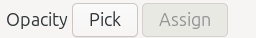
The Dropper tool controls bar
The Dropper tool controls bar is shown above. The table below gives the names and descriptions for each item.
Icon |
Name of the Button and What it Does |
|---|---|
Opacity: Pick: click Pick button to choose the color and alpha value under the cursor; otherwise choose the color premultiplied by the alpha |
|
Opacity: Assign: click Assign button to assign the alpha value to the fill or stroke of the selection |
UNDER REVIEW
Paint Bucket Tool Controls Bar

The Paint Bucket tool controls bar
The Paint Bucket tool controls bar is shown above. The table below gives the names and descriptions for each item.
Icon |
Name of the Button and What it Does |
|---|---|
Fill by:: a dropdown menu offering several options for the fill color |
|
Threshold: a number field where you can enter a value for something |
|
Grow/Shrink by: a number field where you can enter the number of pixels by which you want to automatically grow or shrink the object |
|
Units: a dropdown menu offering several units for the Grow/Shrink value |
|
Close Gaps:: a dropdown menu offering four gap choices |
Todo
1 – fix all these links if necessary - I’m not sure where the Paint Bucket tool will be covered in the manual 2 – add the last icon – some kind of reset - waiting for support
UNDER REVIEW
Tweak Tool Controls Bar

The Tweak tool controls bar
The Tweak tool controls bar is shown above. The table below gives the names and descriptions for each item.
Icon |
Name of the Button and What it Does |
|---|---|
|
Move Object Any Direction: moves selected objects in any direction |
|
Move Object Toward Cursor: moves selected objects toward the cursor |
|
Move Object in Random Directions: moves selected objects in random directions |
|
Shrink Objects: shrinks selected objects |
|
Rotates Objects: rotates selected objects |
|
Duplicate Objects: duplicates selected objects |
|
Push Paths Any Direction: pushes parts of paths in any direction |
|
Shrink Paths: shrink parts of paths |
|
Attract Path Towards Cursor: attracts parts of path towards cursor |
|
Roughen Paths: roughen parts of paths |
|
Paint Selected Objects: paint the tool’s color on selected objects |
|
Jitter Colors: jitter colors on selected objects |
|
Blur Objects: blurs selected objects |
Width: a number field for setting the width of the tweak area |
|
Force: a number field for setting the strength of the tweak action |
|
|
Pressure of the Input Device: Use the pressure of the input device to alter the force of the tweak action |
Channels: buttons H, S, L, and O - in color modes, act on Hue, Saturation, Lightness, and Opacity |
UNDER REVIEW
Spray Tool Controls Bar

The Spray tool controls bar 1 of 2

The Spray tool controls bar 2 of 2
The Spray tool controls bar is shown above. The table below gives the names and descriptions for each item.
Icon |
Name of the Button and What it Does |
|---|---|
|
Spray Mode Copies: sprays copies of the selection |
|
Spray Mode Clones: sprays clones of the selection |
|
Spray Unioned Objects: sprays objects in a single path |
|
Erase Sprayed Objects: erase sprayed objects from selection |
Width: a number field to enter the width of the spray area |
|
|
Pressure of the Input Device: Use the pressure of the input device to alter the width of the spray area |
Amount: a number field to enter the number of objects sprayed per click |
|
|
Pressure of the Input Device: Use the pressure of the input device to alter the number of objects sprayed per click |
Rotation: a number field to rotate the sprayed objects |
|
Scale: a number field to scale the sprayed objects |
|
|
Pressure of the Input Device: Use the pressure of the input device to alter the scale of sprayed objects |
Scatter: a number field to scatter the sprayed objects |
|
Focus: a number field to focus the sprayed objects in a small area, or spread out in a larger area |
|
|
Apply Non-Transparent: spray over non-transparent areas |
|
Apply Over Transparent: spray over transparent areas |
|
No Color Overlaps: prevent color overlaps |
|
Prevent Overlapping Objects: prevents overlapping objects |
|
Pick Color From Drawing: picks a color from a drawing |
Todo
1 - find out exactly where the Spray tool will live, and fix all the links 2 - double-check No Color Overlaps and Prevent Overlapping Objects
UNDER REVIEW
Eraser Tool Controls Bar

The Eraser tool controls bar
The Eraser tool controls bar is shown above. The table below gives the names and descriptions for each item.
Icon |
Name of the Button and What it Does |
|---|---|
|
Delete Objects: deletes selected objects when touched by eraser |
|
Cut Out: cuts out the width of the eraser in selected objects, similar to the path operation Difference |
|
Clip from Objects: cuts out the width of the eraser in selected objects, creating a clipping path |
Width: a number field to set the width of the eraser |
|
|
Pressure of the Input Device: Use the pressure of the input device to alter the width of the eraser |
Thinning: a number field to set how much velocity of the eraser will thin the width of the stroke |
|
Caps: a number field to set the style of the end caps |
|
Tremor: a number field to set how much tremor or ruggedness the stroke will have |
|
Mass: a number field to set the mass of the stroke |
|
|
Break Apart: break apart cut items |
UNDER REVIEW
Connector Tool Controls Bar

The Connector tool controls bar
The Connector tool controls bar is shown above. The table below gives the names and descriptions for each item.
Icon |
Name of the Button and What it Does |
|---|---|
|
Avoid Selected: the connector avoids selected objects |
|
Ignore Selected: the connector avoids selected objects |
|
Orthogonal: the connector is orthogonal |
Curvature: a number field to curve the connector path |
|
Spacing: a number field to set how much space to leave around objects when the connector paths are auto-routed |
|
|
Nicely Arrange: nicely arrange selected connector network |
Length: a number field to set the desired length for connector paths when the layout is applied |
|
|
Arrows Point Downward: make connectors with arrows (markers) point downwards |
|
No Overlaps: do not allow overlapping shapes |
UNDER REVIEW
LPE Tool Controls Bar

The LPE tool controls bar
The LPE tool controls bar is shown above. The table below gives the names and descriptions for each item.
Icon |
Name of the Button and What it Does |
|---|---|
|
Disable: disables all tools |
|
Line Segment: draws a path with the LPE Line Segment applied to it |
|
Circle from 3 Points: draws a circle from three points using LPE |
|
Circle from Radius: draws a circle by the radius |
|
Parallel Line: draws a parallel line |
|
Perpendicular Bisector: draws a perpendicular line that bisects the original line |
|
Angle Bisector: draws a line that bisects the angle |
|
Mirror: draws an object that mirrors the original |
|
Bounding Box: shows the bounding box |
|
Limiting Bounding Box: shows the limiting bounding box |
Line Segment Type: a dropdown menu offering options for line segment type |
|
|
Show Measuring Info: displays the measurement on the canvas |
Units: a dropdown menu offering a choice of units |
|
|
LPE Dialog: opens the LPE dialog |
UNDER REVIEW
Measurement Tool Controls Bar

The Measurement tool controls bar
The Measurement tool controls bar is shown above. The table below gives the names and descriptions for each item.
Icon |
Name of the Button and What it Does |
|---|---|
Font Size: a number field to set the size of the font that displays the measurements |
|
Precision: a number field to set how many decimal places you want for the measurements |
|
Scale: a number field to set the percent for the scale - scales the measurements without scaling objects on the canvas |
|
Units: a dropdown menu offering a choice of units |
|
|
Measure Only Selected: measures only selected objects (excludes guides/grids) |
|
Ignore First and Last: does not display the first and last values (which are often shown twice, depending on settings) |
|
Show Measurements Between: shows intermediate measurements |
|
Show Hidden: show hidden intersections |
|
Measure All Layers: measures in all layers |
|
Reverse Measure: reverses the measurements |
|
Phantom Measure: creates a partially transparent raster copy of the measurements |
|
To Guides: includes measurements to guides |
|
Convert to Item: converts all the measurement lines and labels to actual objects on the canvas |
|
Mark Dimension: creates dimension line and labels in a drafting style, that are objects on the canvas |
Offset: a number field to set how far away from the measurement lines to draw the dimension lines |
|
|
Settings: a dropdown menu with more settings for the Measurement tool |
UNDER REVIEW
Zoom Tool Controls Bar

The Zoom tool controls bar
The Zoom tool controls bar is shown above. The table below gives the names and descriptions for each item.
Icon |
Name of the Button and What it Does |
|---|---|
|
Zoom In: zoom in by configurable steps |
|
Zoom Out: zoom out by configurable steps |
|
Zoom 1:1: zooms to the original level, 100% |
|
Zoom 1:2: zooms to half the original, 50% |
|
Zoom 2:1: zooms to twice the original, 200% |
|
Zoom Selection Window: zooms to fit the selection in the window |
|
Zoom Drawing Window: zooms to fit the drawing in the window |
|
Zoom Page Window: zooms to fit the page in the window |
|
Zoom Width Window: zooms to fit the page width in the window |
|
Center Page: centers the page in the window, zoom level does not change |
|
Previous Zoom: zooms to the previous zoom level |
|
Next Zoom: zooms to the next zoom level |
Todo
Create new chapter in manual. Temporarily used “Zooming and The Zoom Tool”. If it changes, fix all the links.
UNDER REVIEW
Pages Tool Controls Bar

The Pages tool controls bar
The Pages tool controls bar is shown above. The table below gives the names and descriptions for each item.
Icon |
Name of the Button and What it Does |
|---|---|
|
New Page: create a new page |
Page Type: a dropdown menu for choosing what type of page is needed |
|
|
Set Margins: opens a dropdown menu where the margins can be set |
Margins: a field where you can type in the margins, if they are not automatically set |
|
Page Labels: a field where page labels (i.e. page numbers) can be typed; is only active when more than one page has been created |
|
|
Move Objects: move objects on the page along with the page, when the page is moved |
Todo
Create new chapter. Temporarily put in Doc Mgmt > Document Setup > Multiple Pages > Pages Tool. Fix all the links if that changes.
UNDER REVIEW
- Selector Tool
- Node Tool
- Shape Builder Tool
- Rectangle Tool
- Ellipse/Arc Tool
- Star/Polygon Tool
- 3D Box Tool
- Spiral Tool
- Pen Tool
- Pencil Tool
- Calligraphy Tool
- Text Tool
- Gradient Tool
- Mesh Gradient Tool
- Dropper Tool
- Paint Bucket Tool
- Tweak Tool
- Spray Tool
- Eraser Tool
- Connector Tool
- Measure Tool
- Zoom Tool
- Pages Tool